
A Guide to Creating Datatypes
Widgets
Widgets are controls used in input forms that serve as form fields. You can see widgets when you add data items in C1 or in input forms on web pages. They get values the user enters and pass these values to the data type fields they are mapped to. Each widget has a specific field behind it. The type of the widget depends on the type of this field.
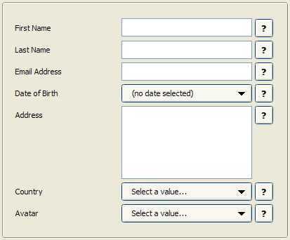
Figure 16: Widgets
When you add fields to a data type, C1 sets a default widget for this field. However, you can replace the default widget with some other widget available for this type of the field.
Some simple field types might only have one widget associated with it (for example, the integer field), while other field types can have a set of widgets you can choose from (for example, the string field).
Let’s start with learning how to set a widget for a field and go on to have a look at the widgets available in C1.
Quick Search in Dropdown Lists
The selector widgets with dropdown lists allows you to quickly find an item in the list.
Start typing the word you want to find in the list, and the list will drop down, filter out all non-matching items and pre-select the first matching item.
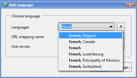
Figure 17: Quick searching in dropdown lists
When you add a field and set its basic and advanced properties, you might also need to select a proper widget to render this field. C1 selects a default widget for the field you add. You can however replace the default widget with some other widget if more are available for this type of a field.
To select a widget for a field:
- Select a field you want to edit.
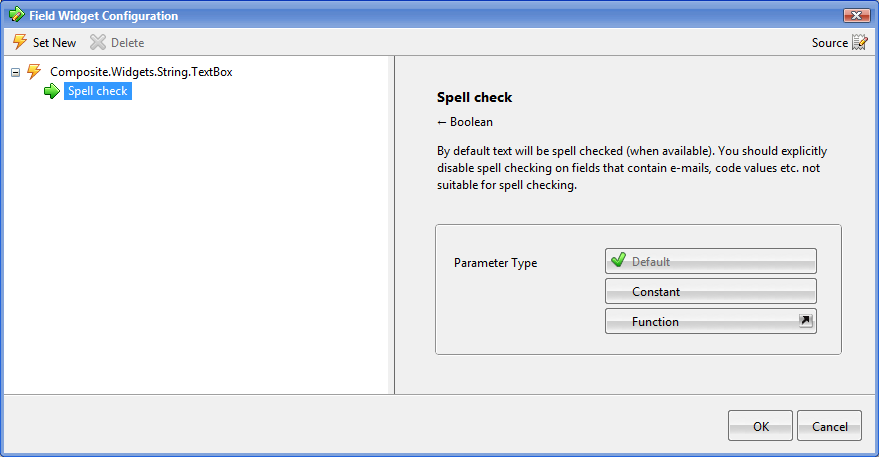
- On the Advanced tab, click the Widget type field to open the Field Widget Configuration window. It already has a widget selected.
Figure 18: Currently selected widget
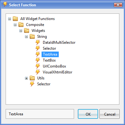
- Click Set New to open the Select Function window. Here, you can see all the widgets available for this specific field.
Figure 19: Selecting a different widget
- Locate and select the widget you want to set for the field and click OK.
- Click OK in the Field Widget Configuration window.
The Widget type field is now set to the widget you have selected.
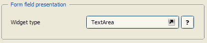
Figure 20: Newly selected widget
C1 features a number of widgets that can be used with one or more data type fields:
- TextBox
- TextArea
- DateSelector
- DateTimeSelector
- CheckBox
- BoolSelector
- VisualXhtmlEditor
- DataIdMultiSelector
- Selector
- Optional Selector
- ImageSelector
- MediaFileSelector
- MediaFileFolderSelector
Let’s have a closer look at some of these widgets.
The TextBox widget serves as an input control for texts strings and numbers.
Figure 21: TextBox
This widget is available for the String, Integer, decimal and GUID fields:
- Composite.Widgets.String.TextBox
- Composite.Widgets.Integer.TextBox
- Composite.Widgets.Decimal.TextBox
- Composite.Widgets.Guid.TextBox
The TextBox widget is default for the String, Integer, Decimal and GUID fields.
The TextArea widget serves as an input control for large texts.
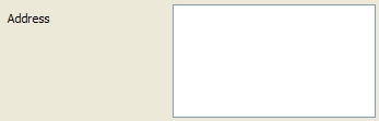
Figure 22: TextArea
This widget is only available for the String field:
- Composite.Widgets.String.TextArea
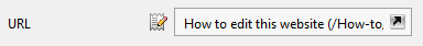
The UrlComboBox allows you to specify absolute URls as well as select a C1 page or C1 media file via the Select Page or File dialog box.
Figure 23: UrlComboBox
To edit the value as a text string, you need to click the Edit button on the left of the widget. To select a page or file, you should click the button in the widget on the right.
This widget is only available for the String field:
- Composite.Widgets.String.UrlComboBox
The DateSelector widget allows the user to select a date as an input value. As the user clicks the widget, a month calendar drops down where the user can navigate to the specific year and a month and select a date.
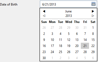
Figure 24: DateSelector
This widget is only available for the Date field:
- Composite.Widgets.Date.DateSelector
The DateSelector widget is default for the Date field.
The DateTimeSelector widget allows the user to select not only a date but also time as an input value. As the user clicks the widget, a month calendar drops down where the user can navigate to the specific year and a month and select a date. When the date is set, the user can edit the time in the widget.
Figure 25: DateTimeSelector
This widget is only available for the Date field:
- Composite.Widgets.Date.DateTimeSelector
The CheckBox widget serves as an input control for selecting one of the two opposite options. Switching between the two options implies checking and unchecking the check box.
Figure 26: CheckBox
This widget is only available for the Boolean field:
- Composite.Widgets.Bool.CheckBox
The CheckBox widget is default for the Boolean field.
The BoolSelector widget is a variation of the CheckBox widget in its purpose. While the checkbox allows the user to switch between two options by checking and unchecking the check box, the BoolSelector widget allows the user to select one of the two radio buttons representing two options.

Figure 27: BoolSelector
This widget is only available for the Boolean field:
- Composite.Widgets.Bool.BoolSelector
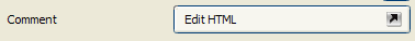
The VisualXhtmlEditor widget allows the user to launch Visual Editor to specify XHTML-formatted text as an input value for a string field.
Figure 28: VisualXhtmlEditor
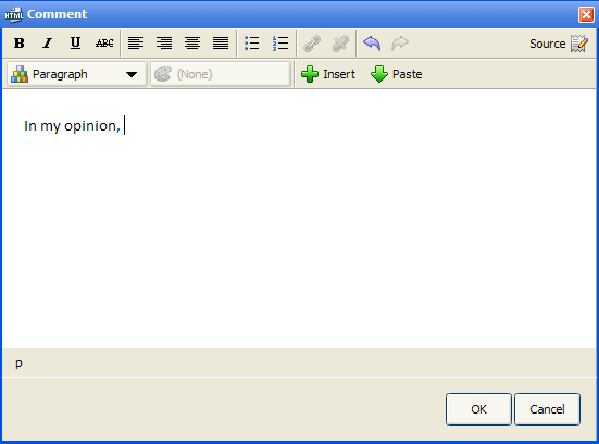
Figure 29: Launched Visual XHTML Editor
This widget is only available for the string field:
- Composite.Widgets.String.VisualXhtmlEditor
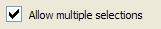
The DataIdMultiSelector widget serves to present a list of input values available for multiple choices. The input values represent entities such as C1 image files, C1 media files, C1 media folders, C1 pages or data items of available data types, which is configured in the widget’s parameters.
It comes in two UI views: verbose and compact, which is also configurable in the widget’s parameters.
The verbose UI view lists values with check boxes next to them. In this way, the user can select one or more values.
Figure 30: DataIdMultiSelector: Verbose UI View
The compact UI view allows the user to launch the selection editor where the user can select one or more values moving them from the list of available values to the list of selected ones.
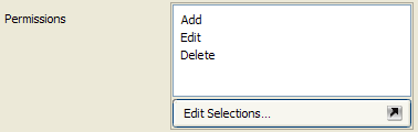
Figure 31: DataIdMultiSelector: Compact UI View
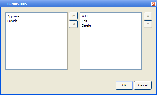
Figure 32: DataIdMultiSelector: Selecting values
This widget is only available for the string field:
- Composite.Widgets.String.DataIdMultiSelector
The Selector widget serves to present a list of input values. For most field types it is associated with, it shows a drop down list where the user can only select one value.
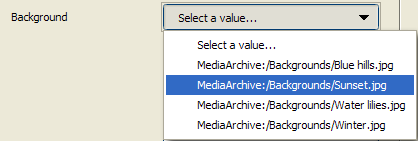
Figure 33: Selector
This widget is available for the string field and data reference fields of different reference types (including available data types):
- Composite.Widgets.String.Selector
- Composite.Widgets.CompositeDataTypesIImageFile.Selector
- Composite.Widgets.CompositeDataTypesIMediaFile.Selector
- Composite.Widgets.CompositeDataTypesIMediaFileFolder.Selector
- Composite.Widgets.CompositeDataTypesIPage.Selector
The Selector widget is default for data type reference types.
Like the Selector widget, the OptionalSelector widget serves to present a list of input values. However, it includes another value: <NONE>, which allows the user not to select any of the values available.
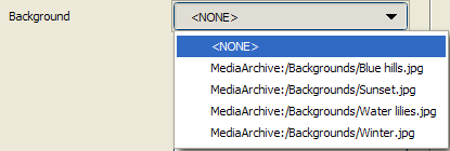
Figure 34: OptionalSelector
This widget is available for the string and data reference fields of different reference types (including available data types):
- Composite.Widgets.String.OptionalSelector
- Composite.Widgets.CompositeDataTypesIImageFile.OptionalSelector
- Composite.Widgets.CompositeDataTypesIMediaFile.OptionalSelector
- Composite.Widgets.CompositeDataTypesIMediaFileFolder.OptionalSelector
- Composite.Widgets.CompositeDataTypesIPage.OptionalSelector
Apart from the Selector and OptionalSelector widgets you can use with the Data Reference fields, there are specific selector-like widgets available for C1 Page, C1 Image File, C1 Media File and C1 Media Folder reference types:
- PageSelector
- ImageSelector
- MediaFileSelector
- MediaFileFolderSelector
Each of these widgets is default for the Data Reference field of the corresponding reference type.